Aurora Orchestra:
Bringing virtuosic performances to life online
Website and edtech platform design for a world-renowned chamber orchestra

outputs:
- Website
- Digital performance platform
- Learning platform
- Design platform
About Aurora Orchestra
Aurora Orchestra are a pioneering chamber orchestra, renowned for their electrifying performances and playful approach.
I’ve worked with them since 2016, collaborating on a whole bunch of projects, from their main website, through to a ground-breaking remote events programme and a digital learning platform that brings rich musical experiences to primary school age children.

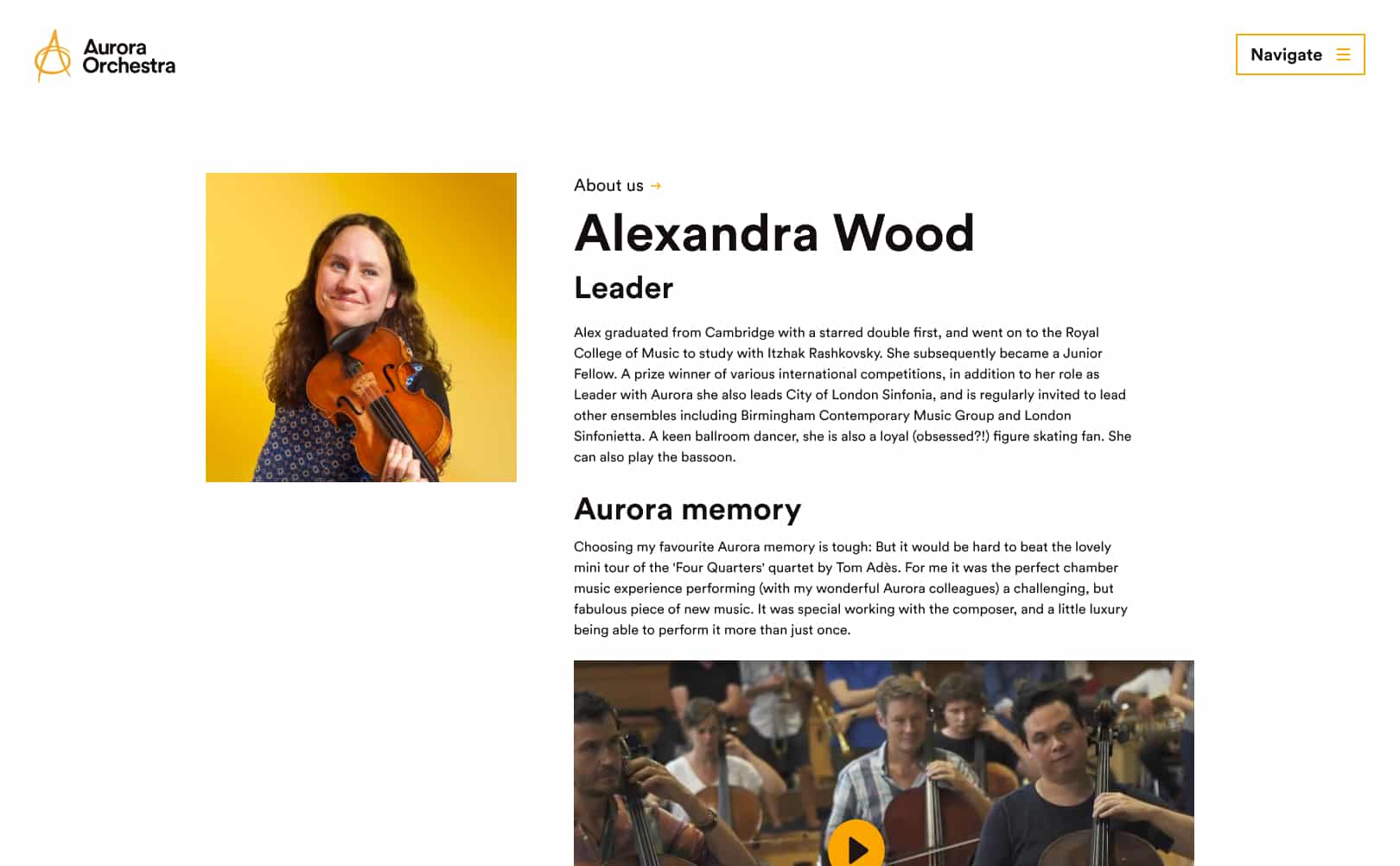
Orchestra websites have a definite look - they’re usually on a dark background, with loads of image banners and text everywhere, and they’re kind of hard to use.
In the spirit of doing things differently, we decided to step away from that. Aurora’s site exists to hold their diverse work up to the light, and invite visitors on a voyage of discovery. Less like a dark concert hall, and more like a well-lit entrance to a world of orchestral adventures.

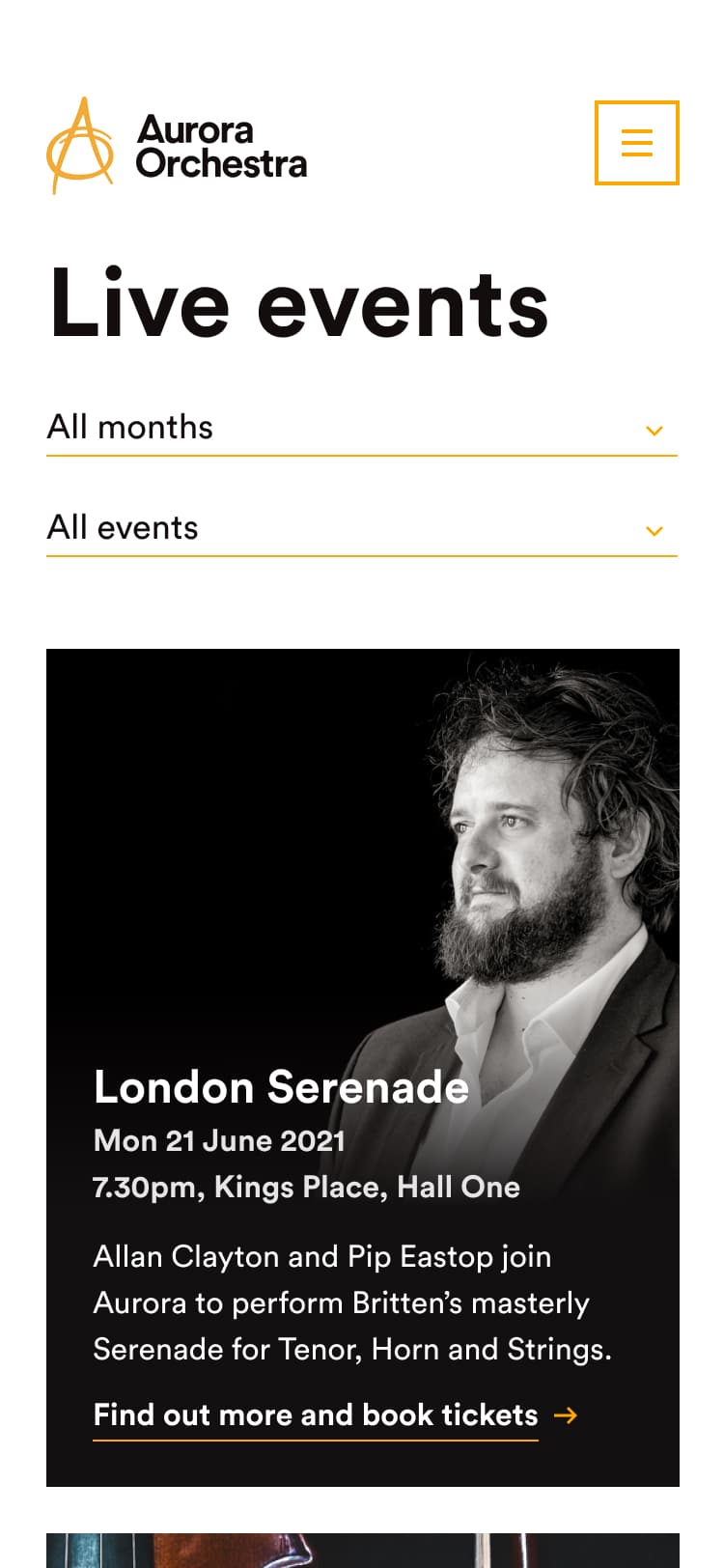
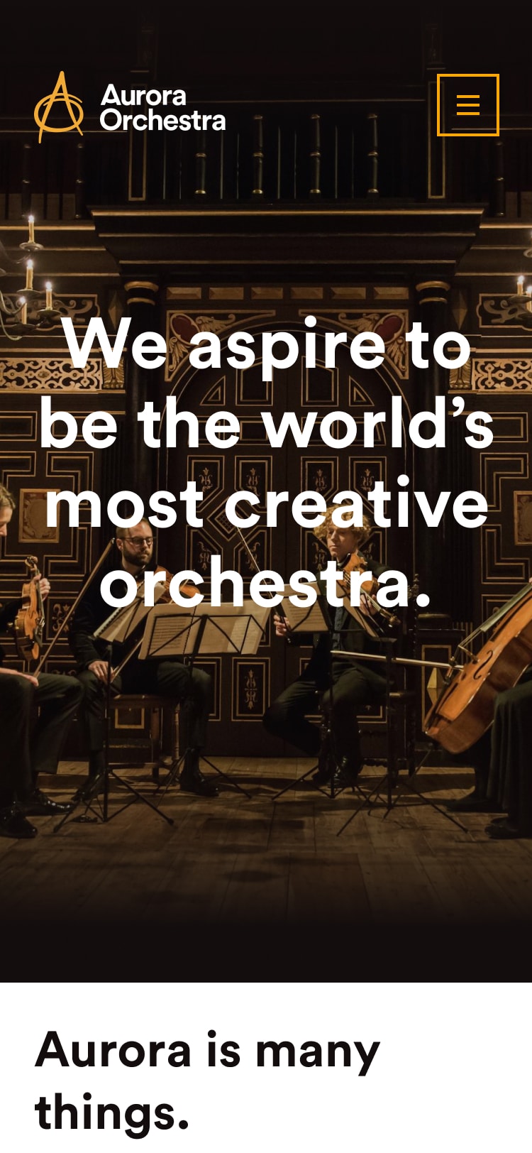
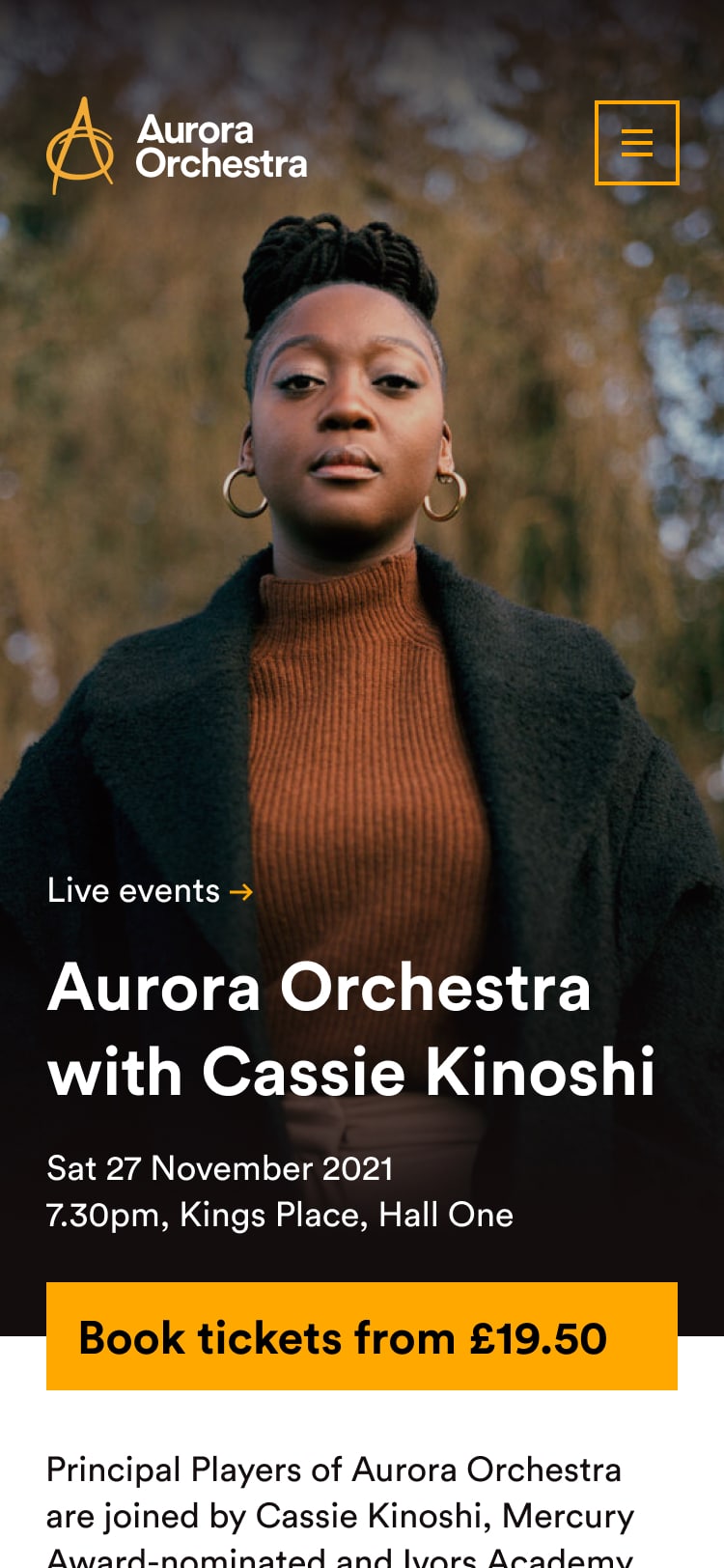
The mobile experience is super important, because people often find out about Aurora events through posters and leaflets in venues.
Clear, crisp typography works with tightly gridded images and pops of accent colour to help visitors do get what they came for, and experience a bit of Aurora magic on the way.
Aurora are educators as well as performers. I helped them figure out how to turn a massive collection of rich educational resources into a digital product, which gives primary school teachers the flexibility to share music with their pupils in a way that matches their specific needs.
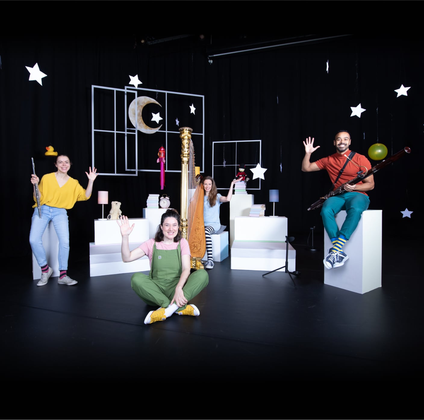
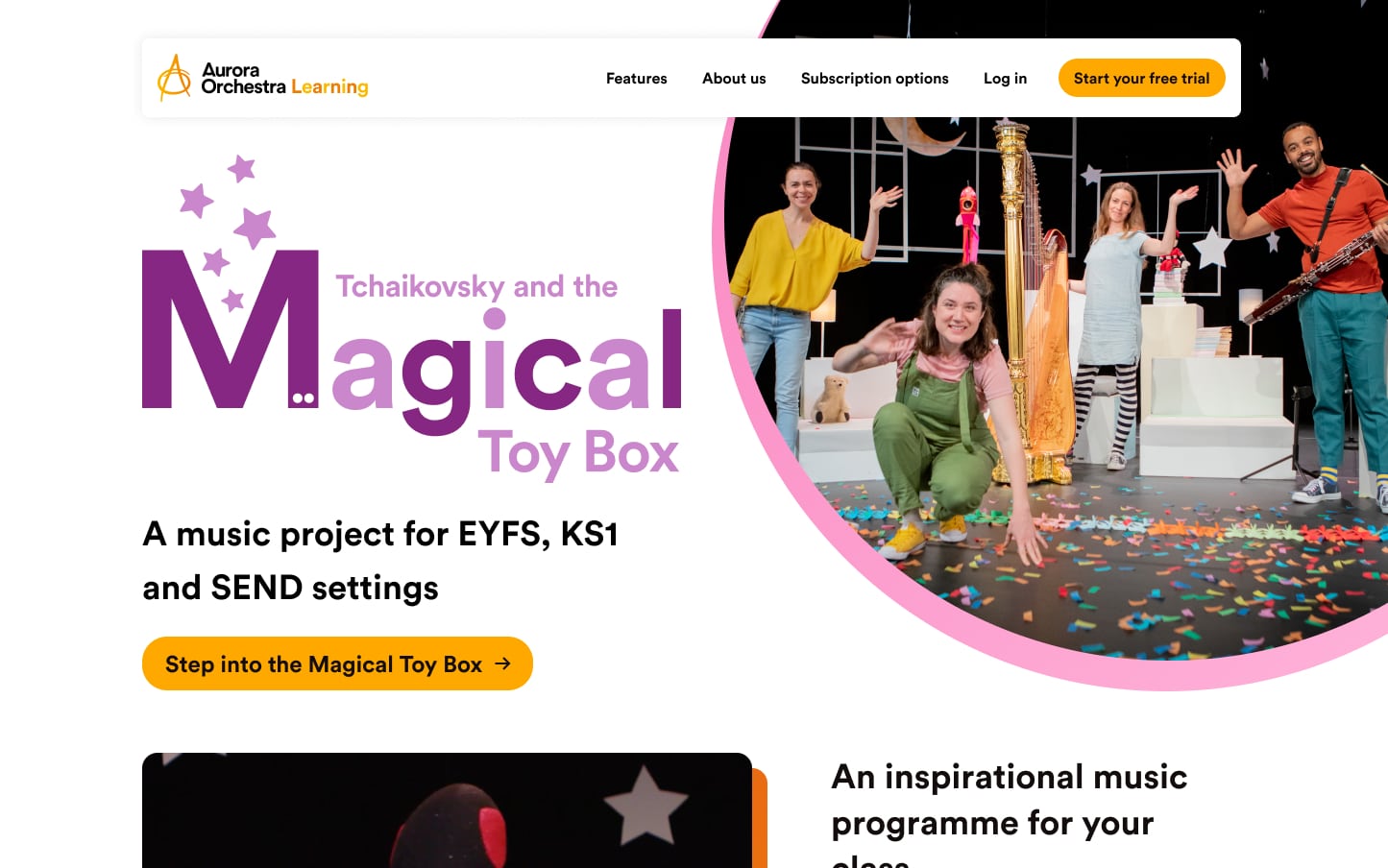
The product site for Aurora Learning takes the best bits of the core Aurora digital brand, and adds colour and roundness to bend them in new, interesting directions. It’s also super optimised for conversion, using a classic Simon Sinek golden circle to tell teachers what’s great about the product and drive them to a time-limited free trial.


The actual learning happens in a webapp. Based on conversations with teachers, we developed a modal interface.
In planning mode, they can easily check out lesson plans, zoom into detail, or build their own lessons from a library of activities.
When they’re in the classroom they can quickly switch to a teaching mode optimised for digital whiteboards, which foregrounds video content and big, tactile buttons, so it’s easy to use when you’ve got one eye on the screen and the other on a room full of rambunctious children.
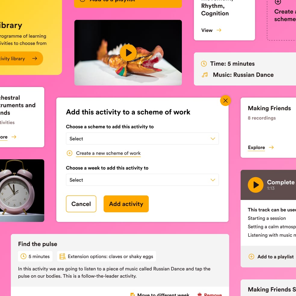
It all runs off a modular design system that minimises the amount of learning teachers have to do when they first arrive. Super-clear contextual navigation and a tight library of repeating interface components move the experience way ahead of outdated educational software.
We got a load of feedback during a pilot phase, and used that to tweak our components. The result is an experience that allows teachers to jump straight in and get value immediately.
“Our creative team love the way Robb translates their ideas into reality. He’s a thoughtful and creative collaborator, and our first port of call for advice when we're wrestling with a new challenge.”
John Harte
Chief Executive, Aurora Orchestra
Honourable mentions
Saboteur look after Aurora’s main visual brand, and they’re very good about letting me twist it and tweak it to bring it to life onscreen.
The outward-facing Aurora sites were built by Long White Digital, a Wordpress micro-agency who do loads of work with charity and arts organisations. The learning webapp was built by Adam Davis.
See for yourself
Check out Aurora's main site at www.auroraorchestra.com.
Aurora Learning is up and running, and being used by a load of teachers - check out the product site. You can sign up for a free trial if you want.
Let's make something
.
Whatever it is, let's make it great.
Get in touch.
robb@orke.design
+44 (0) 7736 459421
© 2019 Ōrke Consultancy Limited.
Company number 12138022.
Proudly cookie-free