Sønr:
Exploring the future of insurance
A new brand and a unique insights platform for a healthier, safer world

outputs:
- Experience maps
- Employee, customer and supplier webapp UX + UI
- Design system
- Innovation concepts
About Sønr:
The insurance industry has seen lots of recent disruption from startups who have the agility and ideas to challenge big companies’ traditional ways of working.
Sønr combines up-to-the-minute data around insurance innovators with perceptive insights driven by humans and AI. That enables businesses to see who’s doing what, who’s investing in who, and where they should turn next to help people live safer, healthier lives (and avoid losing all their customers).
I’ve worked with the Sønr team since they started in 2017, helping them out with brand definition and design, the UX and UI of their insights platform, and a bunch of digital marketing stuff.
The Sønr app is pretty unique in the insurance industry, in that it shares breakthrough insights in a human, sometimes quite arch way. We wanted the visual brand to wrap all that up and instantly feel different to an insurance audience.
The brand mark is based on mazes and sonar screens, and the main brand colour, Sønr Orange, is deliberately opposite to blue, the colour of 98% of the rest of the industry.


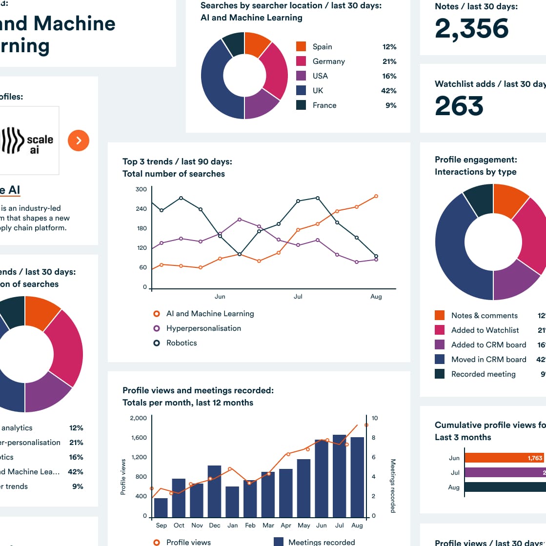
All the data and insights live in the Sønr webapp. It includes data on literally thousands of ventures, so we built in lots of smart search and personalisation features so that as soon as you land you see content that's relevant to you, whether that's based on what you you've looked at in the past, what your team's doing, or what's happening out in the world.
Because it's so personalised, the platform has to be able to show information in lots of unpredictable combinations. I built a modular design system that allows pages to be constructed on the fly based on a 12-column grid, and accomodates a range of data visualisations.
Sønr is sometimes whitelabelled as an internal tool for big insurance businesses, so I also made sure the system could be easily customised to match existing brand typography and colours.


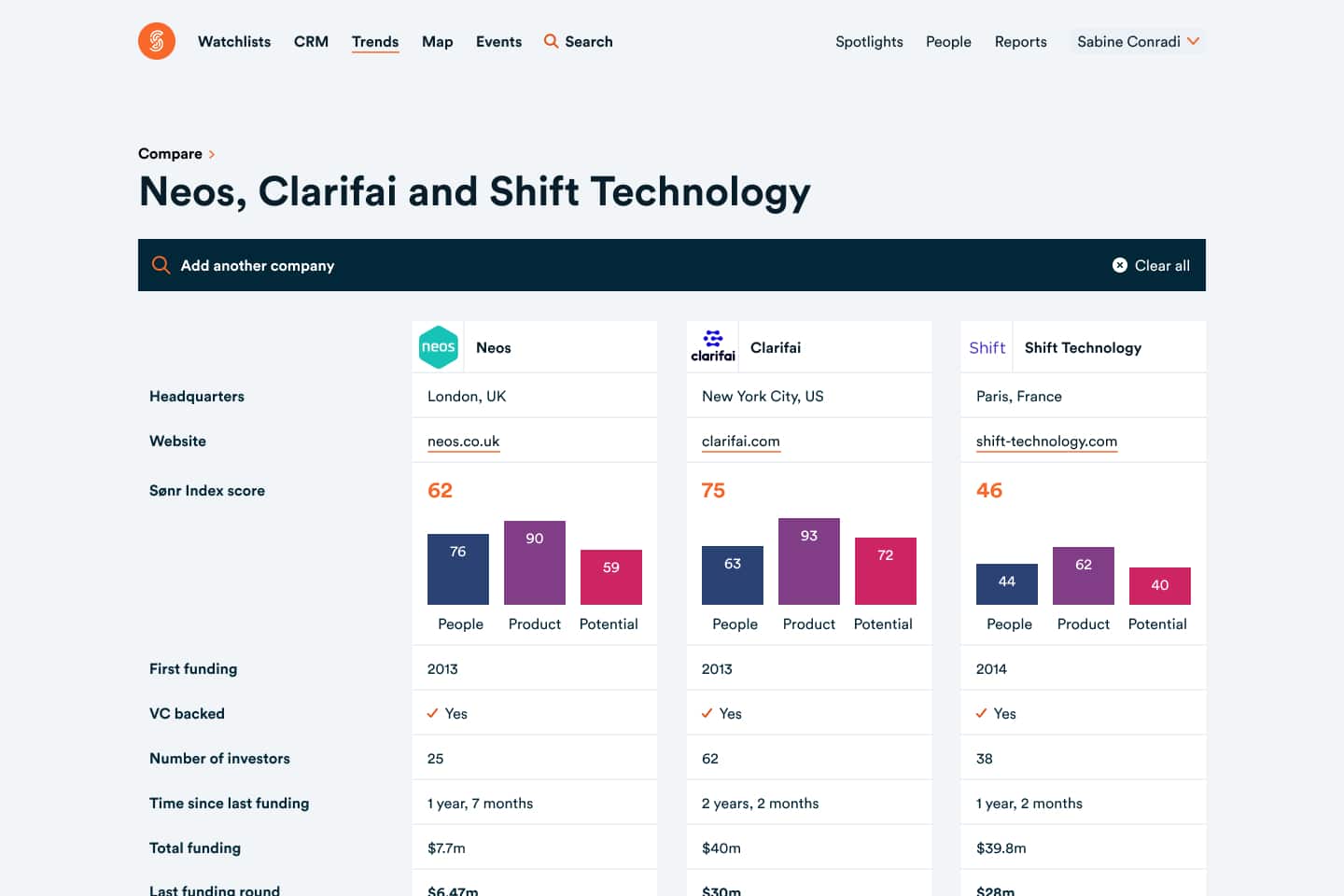
Businesses use Sønr to make big, expensive decisions, so it's really important for them to see data in ways that make sense to them. The platform includes a whole load of charting, comparison and tracking tools.


The core of Sønr's brand promise is around exploration and understanding the future through data. I developed an illustration style that leaned into a vintage sci-fi aesthetic, to help prospective customers feel like they were pushing forward into a new frontier.

Once you're logged into the platform, it's all about data, so there's not much room for extra design flourishes. We decided to have a bit more fun with the product site, which uses loads of those brand illustrations to create a rich visual experience.


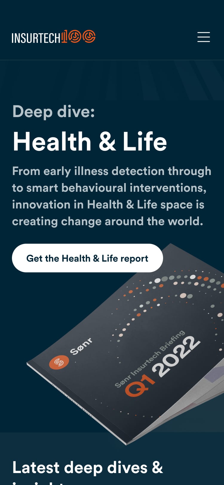
Sønr also publish an annual report into the 100 most interesting insurtech businesses. I designed a special Insurtech 100 experience that facilitates report downloads and collects a bunch of related insights and interviews. Every quarter, the homepage updates to focus on a different, smaller report, to drive engagement through the year.
“Robb’s helped us create a genuinely world-class product. Sønr wouldn’t be half what it is today without his help and guidance.”
Matt Connoly
founder, Sønr
Honourable mentions
When we first built the platform, Sønr didn't have a tech team. Jon Pearse did all the clever stuff on the platform, and Kat Dixon made the product site.
They've got a proper team now, but they don't have time to do everything, so I brought Hannah Royce-Greensill, a developer from the Ōrke network, in to build the Insurtech 100 site.
See for yourself
You have to pay an awful lot of money to get access to the Sønr platform, and to be honest it's probably quite boring if you don't work in insurance.
You can look at the marketing site for free though.
Let's make something
.
Whatever it is, let's make it great.
Get in touch.
robb@orke.design
+44 (0) 7736 459421
© 2019 Ōrke Consultancy Limited.
Company number 12138022.
Proudly cookie-free