Bower Collective:
Sustainable living made simple
Brand, product and service design to help eliminate plastic waste

outputs:
- Brand + visual identity
- Online + physical design system
- Website UX + UI
- Packaging design
About Bower Collective
Bower Collective is a digital-first retail brand that delivers premium quality, natural cleaning and personal care products in zero-waste packaging. Lots of their products come in pouches - you squeeze them out into your reusable dispensers, then send the pouches back. They get refilled and reused, eliminating plastic waste.
I’ve worked with Nick, one of the founders of Bower, for many years. We've collaborated on Bower Collective since he and Marcus, his co-founder, started the business in 2019. In that time I’ve worked on everything from brand and proposition to the nuts and bolts of their reuse service and how their physical products look.
Nick and Marcus had been thinking about Bower for a while before we met, and brought a clear idea of their target audience - people with money but no time, and more than their fair share of climate anxiety - backed by some great insight.
We quickly shaped a brand around that insight. Time and money were tight, so we started with just a logo, a few colours and some typefaces. That gave us enough to test and show to investors, and to use as a base to build from in future.


Working up from our minimum viable brand, we built a rich visual language across digital and physical touchpoints.
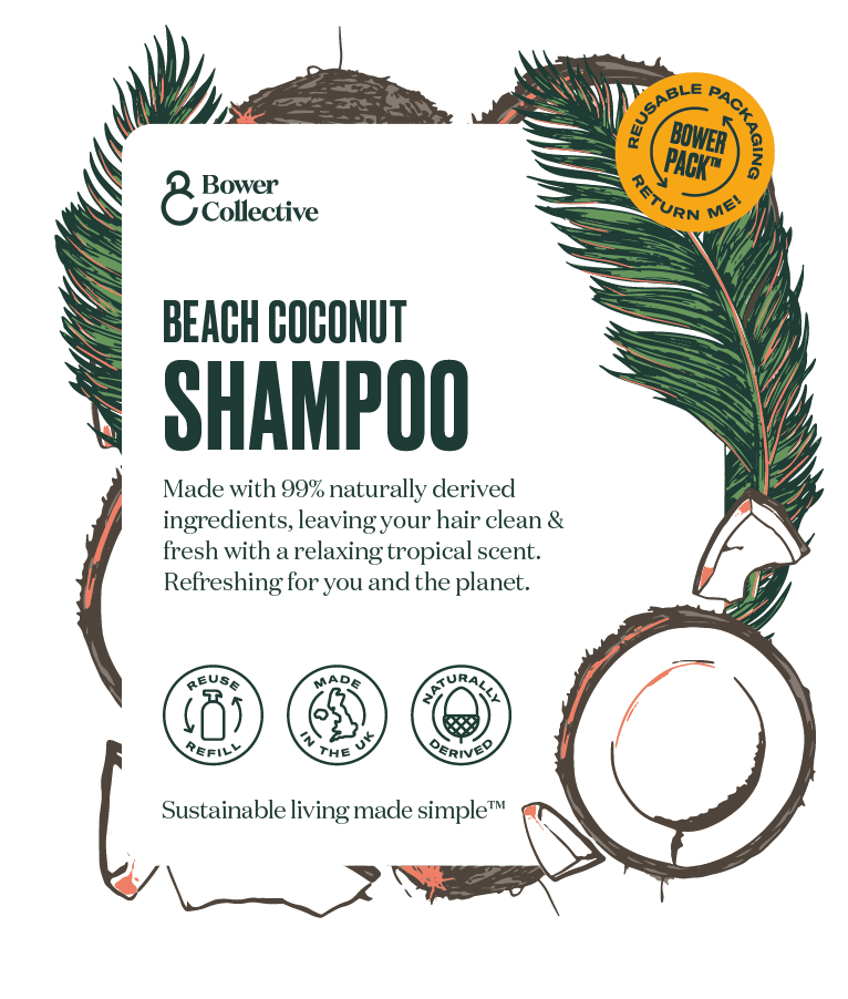
The pouches products arrive in are a key part of the Bower experience, so we gave them lots of love. Each fragrance has its own unique illustration that gets screen-printed onto the pouch.
There are lots of Bower products that don’t come in pouches, too - everything from lip balm to sponges to tote bags. I designed a packaging system that uses typography and iconography to create a strong family resemblance, with enough scope for variation that people can easily distinguish between different ranges.

Bower’s website is their key acquisition channel, but they're not just any old shop, and it's important that customers understand the subscription model and the fact that packaging can be returned for reuse.
Over the first few months we quickly iterated and tested different ways of explaining how being a Bower customer works, using what we learned as the centre of the brand experience.
We knew from some initial research that Bower customers wanted to be able to easily see which attributes a given product had. A characterful set of custom icons, used across physical products and digital experiences, show you at a glance whether a product’s right for you.


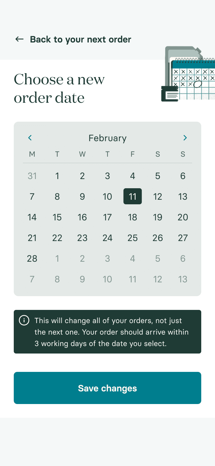
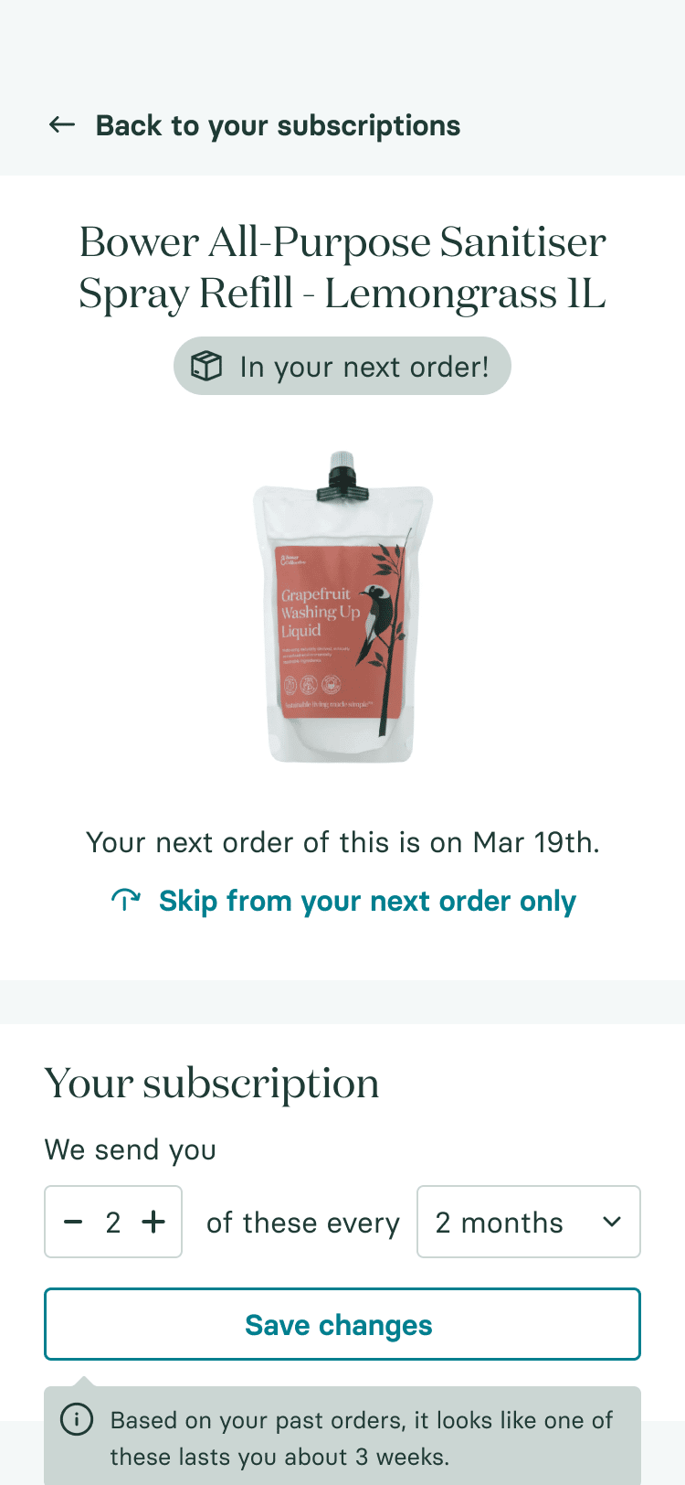
Switching home and personal care products to subscriptions is tough, because it’s hard to anticipate how long things will last, and it feels like a big commitment.
A super-clean customer portal experience that allows Bower customers to contextually manage their deliveries and products, so they always know they’re getting what they need, when they need it. Compared to the MVP customer portal we launched with, it's reduced customer service calls and increased AOV and LTV.
Bower’s wider purpose is a really important differentiator, and helps them build emotional connections with their customers. Throughout our time working together, I’ve done a bunch of custom illustration and design work to help them tell their story, both through digital experiences and annual impact reports.
Custom illustration can feel like a luxury, but it's a really important part of Bower's brand experience, elevating them above the rash of similar businesses that have popped up since they started.

"Robb's been instrumental in helping us imagine and develop a category-leading brand and experience for Bower Collective. He's an outstanding creative and a very important, much valued member of our team."
Nick Torday
Co-founder, Bower Collective
Honourable mentions
I worked closely with Keir Moffat and Paola Gutierrez, two amazing developers, on all of the early Bower tech. They have a proper internal team now (who are also excellent), who I made the customer portal with.
I also got Mat Ealam, a designer from my network, in to help out with some specialist design stuff.
See for yourself
Check out the Bower site and get yourself some lovely new washing up liquid. You can also download their 2021-22 impact report if you want some bedtime reading. Don’t print it out though! Save the trees.
Let's make something
.
Whatever it is, let's make it great.
Get in touch.
robb@orke.design
+44 (0) 7736 459421
© 2019 Ōrke Consultancy Limited.
Company number 12138022.
Proudly cookie-free